Friday 28 March 2014

Childhood Dreams & Innocence - A Tag with Linda Cain

Hi again everyone, Linda Cain here for my last spot with
The Artistic Stamper.

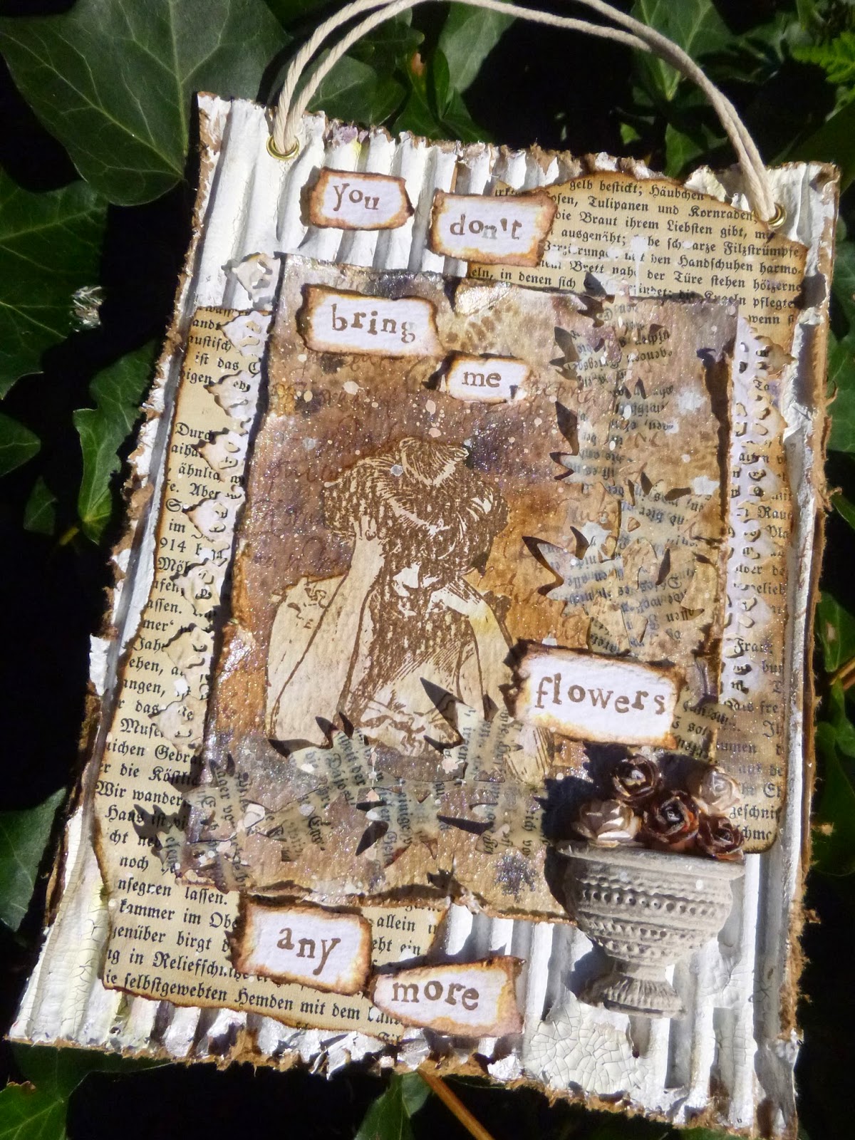
I LOVE tags, and I would be remiss if I didn't share one with you. So I'll take you through a tag of many layers that is simple in design and easily duplicated with any of your favourite stamps.

I start with a #8 tag Manila Tag. To get deep rich colours, you have to use several Distress Inks over the top of each other to create a completely solid coating of colour.
 
 
Here I used Broken China, then Salty Ocean and Peacock Feathers to get a deep, rich blue at the top. Then Dusty Concord and Seedless Preserves are added to the bottom. To add a bit of brightness to the centre area, I used Picked Raspberry.

Last a bit of the purples on the top edges to blend in the colours.
 

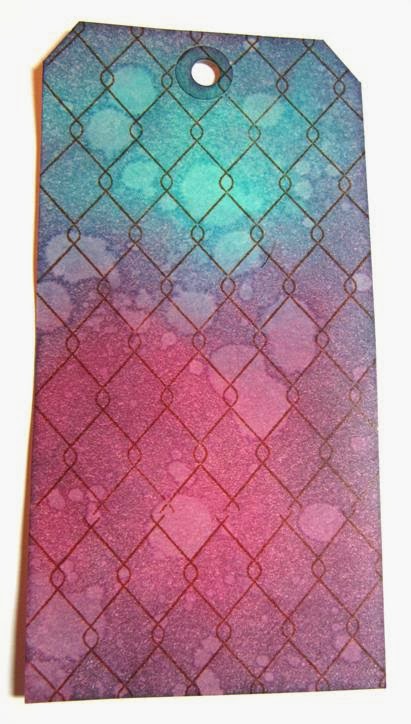
 Since you have a nice deep layer of inks, when you add water droplets, let them sit, and then blot off, you get a great effect without loosing all your colour.
 
 Then stamp with Sepia Archival Ink and the Chicken Wire Background stamp.


I used Jet Black Archival Ink to stamp the Darling Child and the Small Bingo Card at the bottom of the tag.
 
Then I broke out the white Sharpie White Poster Pen to add some detail.
 
 
 I added the large Bubbles Border and Stitches stamps with Snowflake Fresco paint. The Numbers across the top are from the Numerical Plate by Katy Fox.
 
 I stamped 3 different inks and paper combinations with the boy from from Darling Child. One on Manila Tag and one on Stamping Paper with Jet Black ink, the last one on Stamping Paper with Sepia ink.
 
I decided I liked the black ink on Stamping Paper the best. 
 
 
More stamping was added from the Numeric and Darling Child plates. 
 
 
 I used a permanent Gold Sharpie to add colour to the Tag Label, the Arrow, and the Number Brad. Stream Alcohol Ink was used on the Mini Numeral 7 and sanded it down to distress a bit.
 
 
For the bow, first spray a bit of water onto the Crinkle Ribbon,  then add the same colours of Distress Inks directly from the pad to the ribbon.
 
Crumple it up and dry with a Heat Tool
  
 
The ribbon is tied into a bow with the #5 Tag Label added with 2 jump rings. I punched a hole through all the layers and added the Number Brad over the stamped number 8.
 
The Boy is cut out and added with black foam squares for some depth.
 
Well people, that's it for me. I enjoyed being here with all of you.I hope you've learned something or just had fun following along.
 
Check out all the links to The Artistic Stamper store and as always, ask any questions you want.
 
I'm here to serve!
 
Your Friend in ART,
Linda 

Wednesday 26 March 2014

Encourage Inspiration ATCs by Astrid

Hello everyone and lovely to have you drop by here! I have been having loads of fun altering playing cards recently and that got me in the mood for playing with a smaller format, so today I would like to share 3 mixed media ATCs with you....
I used just two stamp sets for this project, Katie Fox Numerical and Journaling Words 3
This is how I went about it:
I cut 3 bits of card to ATC size (2.5 x 3.5") and covered them with Tissue Wrap, wrinkling it up a bit to get some texture.
Next I added some Distress Paints, Picket Fence and Frayed Burlap
This was followed by some messy background stamping with various stamps from the Numerical plate, mostly with Jet Black Archival, but on one of them also with Red Geranium.
I'll show you some close ups and talk you through some of the details:
I have a thing about hearts at the moment, all three ATCs have a heart on them, these were created with the help of one of the new Crafters Workshop Stencils, the Gothic Romance one. It has hearts in two sizes and some really cool other patterns, I just love these new stencils!! You can see one of the patterns done rather messily in Picket Fence Distress Paint. The heart itself and all the other colours were done with Distress Markers.
I used a really cool technique for this: After you have finished your stamping, cover the whole surface with a thin layer of Glue N Seal. I used Matte. Once it has dried, scribble your Distress markers where ever you want some colour and just blend with your finger. You get a lovely translucent layer of colour. On this one I used Fired Brick, Bundled Sage, Aged Mahogany, Broken China, Black Soot and Walnut Stain.
For this one I used a larger heart on the same stencil, more of the Numerical stamps, both in Black and Red Geranium. I also stamped a bit with a bottle cap and some more Picket Fence Distress Paint. Colour was added in the same way, similar colours but also Faded Jeans.
And here is the last one, more of the same. I over stamped the heart with some Picket Fence DP, I also added some marks with an old credit card. I wanted these ATCs in a messy mixed media journaling style, with lots of layers.

The Final part was to stamp the word Inspiration from the Journaling 3 plate onto old book paper.
I added it to the side of my hanger and finished it all off with some Chit chat stickers and Label Letters.
Well, there you have it, - not quite my usual style, but I had fun playing and I hope you like it.

Thanks so much for visiting, and if you are interested in becoming part of our Design Team, check out Jennie's DT call!!

Monday 24 March 2014

You don't bring me flowers...

Hello all, Alison (butterfly) here again, with a musically-inspired hanging for you today.  (Click on the photos for close-ups if you'd like to see more.)


This happens to me a lot... a phrase or song lyric will go round and round in my head until I'm pretty much forced to allow it to play along.  If you want to listen while you look, You Don't Bring Me Flowers is the song that invaded this creation!


I know this song was triggered by the new toy I was playing with to create the stone urn on this piece... there's something very melancholy about old stone planters in my head, and that dictated how this piece took shape.


Jennie has just added these fabulous Katy Sue Designs silicone moulds to The Artistic Stamper shelves.  There are some really lovely and intricate moulds - and I thought this little trio might have dollshouse potential as well as crafty applications.


I had meant to use some air-drying clay, but when push came to shove I wasn't patient enough to wait for it to dry, so instead I melted some beeswax in a tart tin, using my heat tool, and poured that into the moulds.


I sealed it with multi-medium, and then painted it with various colours, including the marvellous Stone Fresco.  The little mulberry paper flowers are from my stash.


Regulars will know that when I need melancholy, I usually reach for the Gibson Girls, and this woman was perfect for my purposes.


I stamped her in Potting Soil Archival onto some Distress Watercolour Cardstock, and then used a mask to allow me to ink and stamp around her.


I stencilled around her using the new Tim Holtz Doily mask, and stamped with my favourite Calligraphy Mat, but lots of the layers have almost disappeared under the final spritzing of Perfect Pearls Mist in Pearl.


Worth it for the shimmer - though it's hard to capture in a photo.


The book page ivy strands had been sitting around on my desk for ages (created for this art journal page at the beginning of February, but then that needed something darker).


Despite the layer of beeswax covering them, they're pretty fragile, so it's a miracle they've survived this long!


The watercolour panel is layered up over some distressed book pages...


... with some die-cut paper lace tucked under the edges.


Another crack at that shimmer here... with lace and book page and corrugated card and all!


The words are stamped on another piece of watercolour cardstock...


... torn...


... and inked around the edges.


And I used gesso and some Picket Fence Crackle Paint on the corrugated background to create a shabby chic look.


I rather like all the layers of distressed elements, and the masking of the main image which I think really makes her pop.


A couple of eyelets and some pale twine, and it's ready for hanging.


Thank you for stopping by.  There's still almost a week to join in with our Words and Numbers challenge - hope to see you there!

Ingredients used:
Artistic Stamper stamps: Gibson Girls #1, Calligraphy Mat #19
Katy Sue Designs Silicone Moulds - Pots and Urns
Tim Holtz Spring Greenery Decorative Strip Die
Tim Holtz Layering Stencil - Doily
Distress Watercolour Cardstock
Distress Inks - Walnut Stain, Vintage Photo
Archival Inks - Coffee, Potting Soil
Fresco Paint - Stone, Snowflake and various others
Distress Crackle Paint - Picket Fence
Gesso
Ranger Beeswax
Blending Tool
Mini Blending Tool

Friday 21 March 2014

Coz I luv U...

Hello messarounders, this is Titbelsoeur here showing you my very last card, with lots of love !
 

This love quote, stamped on a paper mat, should disconcert you... yes, you are not used to see me doing shabby things with lace and wet-eyed kitten pictures...
But I love to mix styles that don't fit together...
that is why I have first stamped backgrounds on a leftover page, for a grunge look :

Sequin Waste open and Dots Background :
 

 Dance Dictionary Background


And I have added this mat, stamped with lots of love from the Grungy Greetings #1 plate


But my card looked quite nude with only this stamped mat... then I stamped the spring flowers from the Encyclopaedia Botanica  plate on to a book page, I cut it out and colored it lightly with watercolor chalks :


And tadammmm, here is my love card for Spring :


I would be very happy if my card does inspire you, 
thank you so much for stopping by, 
I am looking forward to reading your comments !

A tout bientôt,

 
And if you want to remind of the 70's luv songs, just pop up to my blog... ;-)

Tuesday 18 March 2014

Bold Blooms by Alison (Craftytrog)

Hello Stampers! 
As Mothering Sunday is fast approaching, I thought I'd share some bright & bold statement jewellery that would make a nice gift for Mum. Of course, you could always make some for yourself instead!
Here's how I made the set...
I took 3 Stampbord pieces, 2 one inch square, & 1 two inch square. This is a fantastic surface to work on, & takes inks beautifully. 
I applied alcohol ink (sunset orange, watermelon, & raspberry), using felt on an applicator tool, layering until I had the look I wanted.
I then sanded back the colour in the middles a little, to lighten.
Then I used a scratching tool to scratch some white highlights. This adds a lovely depth to the pieces.
I used the black archival ink pad to ink all of the sides & edges, to add a frame to my artwork.
Next, I embossed my pieces with clear ultra thick embossing enamel. I used 3 layers of embossing.
In the picture below, I have just embossed the large piece. You can see the difference the embossing makes, it really brings out the colours, and adds a beautiful shine, of course.
To finish, I added jump rings, metallic beads & ear wires for the earrings, & a ball chain for the pendant.
I hope you like this bright little set,

thanks for visiting,
Alison xxx